
BASHA TECH
Ch04. 그래프 그리기 본문
728x90
4-1. 데이터 시각화가 필요한 이유
- 앤스콤 4분할 그래프 살펴보기
- 앤스콤 데이터 집합 모두 사용해 그래프 만들기
4-2. matplotlib 라이브러리 자유자재로 사용하기
- 기초 그래프 그리기
- 다변량 그래프 그리기
4-3. seaborn 라이브러리 자유자재로 사용하기
4-4. 데이터프레임과 시리즈로 그래프 그리기
4-5. seaborn 라이브러리로 그래프 스타일 설정하기
# anscombe dataset load
import seaborn as sns

anscombe = sns.load_dataset('anscombe')
anscombe
# 데이터 확인
anscombe.head()
anscombe.info()
anscombe['dataset']# I 그룹 추출
# 데이터 프레임에 대괄호 [] 들어가면 추출
dataset_1 = anscombe[anscombe['dataset'] == 'I']
dataset_1# dataset_1 => 데이터 시각화
import matplotlib.pyplot as plt# plt.plot(x축에 들어갈 값 지정, y축에 들어갈 값 지정, **option) : 선그래프
# dataset_1['x']: x 컬럼 추출
plt.plot(dataset_1['x'], dataset_1['y'],'o')
plt.show()
# plt.plot(x축에 들어갈 값 지정, y축에 들어갈 값 지정, **option) : 선그래프
# dataset_1['x']: x 컬럼 추출
plt.plot(dataset_1['x'], dataset_1['y'],'^')
plt.show()
# 그래프 작성시
# 데이터 추출
dataset_2 = anscombe[anscombe['dataset'] == 'II']
dataset_3 = anscombe[anscombe['dataset'] == 'III']
dataset_4 = anscombe[anscombe['dataset'] == 'IV']
#ctrl+shift+'-' : 셀이 잘림
# 1. 도화지 한 장을 준비 => figure(figsize=(행크기,열크기)) function
%matplotlib inline
fig = plt.figure(figsize=(6,6))
# 2. 도화지 분할 => 2 x 2, 1 x 4, 4 x 1 => add_subplot(행,열,위치값) => 축 생성
ax1 = fig.add_subplot(2,2,1) #2x2로 분할하고 1 행렬에 들어가라 => 축이 return된다
ax2 = fig.add_subplot(2,2,2) #add_subplot => 축이 만들어짐
ax3 = fig.add_subplot(2,2,3)
ax4 = fig.add_subplot(2,2,4)
# 3. 분할된 영역 그래프 작성 => plot(x,y,option) : 선그래프 작성
ax1.plot(dataset_1['x'],dataset_1['y'],'o')
ax2.plot(dataset_2['x'],dataset_2['y'],'o')
ax3.plot(dataset_3['x'],dataset_3['y'],'o')
ax4.plot(dataset_4['x'],dataset_4['y'],'o')
# title
fig.suptitle('Anscombe Data') # 타이틀 부여
fig.tight_layout() # 레이아웃을 겹쳐 보이게 처리
# 4. show()
plt.show()
# matplotlib 기본
# 1. hist
# 데이터 추출 => tips
tips = sns.load_dataset('tips')
tips.head()

tips.info()
# category data => 범주형 데이터

히스토그램 (Histogram)
# 히스토그램 : 연속값이여야 함.
# 1. 도화지 생성
fig = plt.figure()
axes1 = fig.add_subplot(1,1,1)
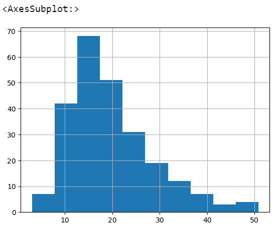
axes1.hist(tips['total_bill'], bins=10) # bins: 등분할 수 (분리할 칸수. 옆칸으로 분리해라)
axes1.set_title('Histogram of Total Bill')
axes1.set_xlabel('Freq')
axes1.set_ylabel('Total Bill')
plt.show()
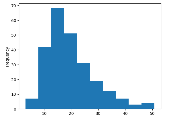
# 히스토그램 : 연속값이여야 함.
# 1. 도화지 생성
fig = plt.figure()
axes1 = fig.add_subplot(1,1,1)
axes1.hist(tips['sex'], bins=10) # 성별 : 연속된 값이 아님
axes1.set_title('Histogram of Total Bill')
axes1.set_xlabel('Freq')
axes1.set_ylabel('Total Bill')
plt.show()
산점도 (Scatter)
# 산점도 => scatter(x축, y축) (분포를 말한다, 축이 2개여야함.)
# total_bill, tips와의 관계 확인
scatter_fig = plt.figure()
axes1 = scatter_fig.add_subplot(1,1,1)
axes1.scatter(tips['total_bill'],tips['tip'])
plt.show()
# 산점도 => scatter(x축, y축) (분포를 말한다, 축이 2개여야함.)
# total_bill, tips와의 관계 확인
scatter_fig = plt.figure()
axes1 = scatter_fig.add_subplot(1,1,1)
axes1.scatter(tips['total_bill'],tips['tip'])
axes1.set_title('Scatterplot of Total Bill vs Tip')
axes1.set_xlabel('Total Bill')
axes1.set_ylabel('Tip')
plt.show()
박스 그래프 (Box Plot)
tips[tips['sex'] == 'Female']

tips[tips['sex'] == 'Female']['tip']

tips['time'].value_counts()

tips[tips['time'] == 'Dinner']['tip']
# Box Plot
# 성별 tip
boxplot_fig = plt.figure()
axes1 = boxplot_fig.add_subplot(1,1,1)
axes1.boxplot(
    [
          tips[tips['sex'] == 'Female']['tip']
        , tips[tips['sex'] == 'Male']['tip']
    ]
)
plt.show()
# Box Plot
# 성별 tip
boxplot_fig = plt.figure()
axes1 = boxplot_fig.add_subplot(1,1,1)
axes1.boxplot(
    [
          tips[tips['sex'] == 'Female']['tip']
        , tips[tips['sex'] == 'Male']['tip']
    ]
)
axes1.set_xlabel('Sex')
axes1.set_ylabel('Tip')
plt.show()
다변량 그래프 : 3개 이상의 변수를 사용한 그래프
일변량 그래프 : 1개의 변수를 사용한 그래프
이변량 그래프 : 2개의 변수를 사용한 그래프
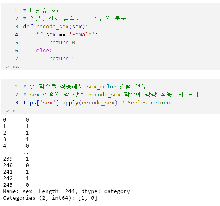
# 다변량 처리
# 성별, 전체 금액에 대한 팁의 분포
def recode_sex(sex):
    if sex == 'Female':
        return 0
    else:
        return 1
# 위 함수를 적용해서 sex_color 컬럼 생성
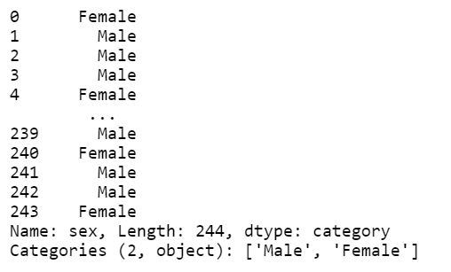
tips['sex'] # Series 나옴
# 위 함수를 적용해서 sex_color 컬럼 생성
# sex 컬럼의 각 값을 recode_sex 함수에 각각 적용해서 처리
tips['sex'].apply(recode_sex) # New Series return
tips['sex'] # 성별의 값이 변경되지 않았다. 새로운 시리즈를 만들어야함.
tips['sex_color'] = tips['sex'].apply(recode_sex) # Series return
tips.head()

scatter_fig = plt.figure()
# axes1 = scatter_fig.add_subplot(1,1,1)
# axes1 = set.title()
plt.scatter(
      x=tips['total_bill']
    , y=tips['tip']
    , s=tips['size'] * 50
    , c=tips['sex_color']
    , alpha=0.5
)
plt.title('total bill vs tip')
plt.xlabel('Total Bill')
plt.ylabel('Tip')
plt.show()

scatter_fig = plt.figure()
# axes1 = scatter_fig.add_subplot(1,1,1)
# axes1 = set.title()
plt.scatter(
      x=tips['total_bill']
    , y=tips['tip']
    , s=tips['tip'] * 30
    , c=tips['sex_color']
    , alpha=0.5
)
plt.title('total bill vs tip')
plt.xlabel('Total Bill')
plt.ylabel('Tip')
plt.show()
sns.lmplot(
      x='total_bill'
    , y='tip'
    , data=tips #dataframe
    , fit_reg=False
    , hue='sex'
    , scatter_kws={'s':tips.size*1}
    # , scatter_kws={'s':tips['size']*1}
    , markers=['*','p']
    # marker 종류 https://matplotlib.org/stable/api/markers_api.html
)
plt.show()
sns.lmplot(
      x='x'
    , y='y'
    , data=anscombe
    , fit_reg=False
    , col='dataset'
    , col_wrap=2
    , size=3
)
tips['total_bill'].plot.hist() #plot은 선그래프

tips['total_bill'].hist() #빈도수
tips['total_bill'].plot.hist()
plt.show() # 그림만 그려라.
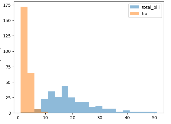
# 다변량으로 처리 => fancy index 사용
tips[['total_bill', 'tip']].plot.hist(alpha=0.5,bins=20)
plt.show()
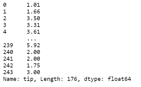
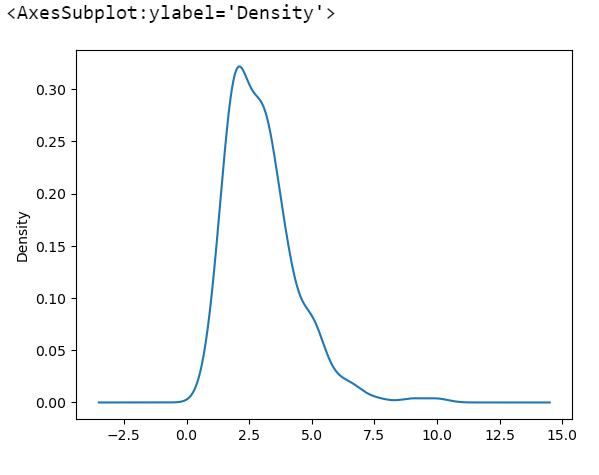
tips['tip'].plot #object가 있다는 tip라는 데이터가 들어있고 도화지 있고 축이 만들어져있다는 뜻

tips['tip'].plot.kde() #밀도로 그려라
#산점도는 x,y값을 지정해야함.
tips.plot.scatter(
      x='total_bill'
    , y='tip'
    # , data=tips #tips로 지정하고 있기 때문에 이건 안해도 됨.
)
tips.plot.hexbin(
      x='total_bill'
    , y= 'tip'
)
tips.plot.box()
sns.set_style('ticks') #dark, darkgrid, white, whitegrid / default=>ticks
sns.violinplot(
      x='time'
    , y='total_bill'
    , data=tips
    , hue='sex'
    , split=True
)
plt.show()
https://plotly.com/python/ : interactive chart를 만들 수 있다.
728x90
반응형
'Computer > Pandas' 카테고리의 다른 글
| Ch06. 누락값 처리하기 (0) | 2022.09.28 |
|---|---|
| Ch05. 데이터 연결하기 (0) | 2022.09.27 |
| Ch03. 판다스 데이터 프레임과 시리즈 (0) | 2022.09.26 |
| 판다스 정리 (0) | 2022.09.26 |
| Ch02. 판다스 시작하기 (0) | 2022.09.23 |
'Computer/Pandas' Related Articles
more


Comments